What If We Had Done Nothing?
Miscategorization bias in science props up the official narrative and fails to explain the facts.
"Miscategorization" has been the word of the hour since the beginning of the Covid era. Whether it was how a "case" was defined, or who was considered "immune.” So, it's no surprise that the same tricks are being employed to promote the vaccine’s "efficacy".
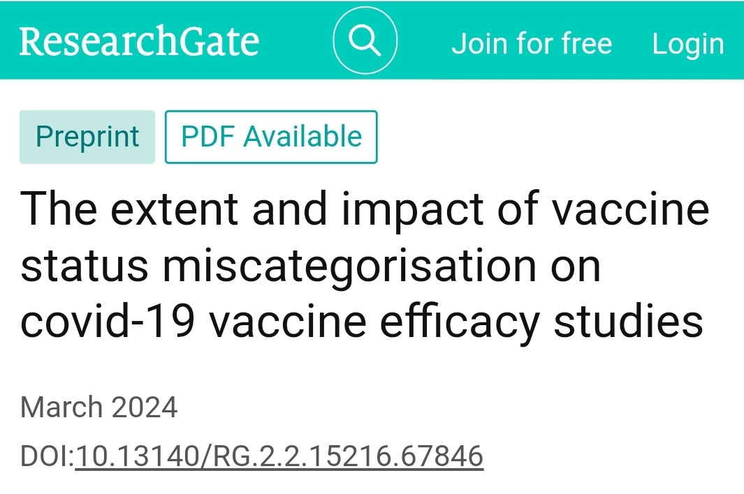
A new preprint by Martin Neil, Norman Fenton, and Scott McLachlan examines this phenomenon of miscategoriztion. You can click on the image to read the study.
Here’s the abstract:
It is recognised that many studies reporting high efficacy for Covid-19 vaccines suffer from various selection biases. Systematic review identified thirty-nine studies that suffered from one particular and serious form of bias called miscategorisation bias, whereby study participants who have been vaccinated are categorised as unvaccinated up to and until some arbitrarily defined time after vaccination occurred. Simulation demonstrates that this miscategorisation bias artificially boosts vaccine efficacy and infection rates even when a vaccine has zero or negative efficacy. Furthermore, simulation demonstrates that repeated boosters, given every few months, are needed to maintain this misleading impression of efficacy. Given this, any claims of Covid-19 vaccine efficacy based on these studies are likely to be a statistical illusion.
A statistical illusion indeed. This article isn’t about that study, but I thought it adds a relevant context to the issue at hand, namely The Science™ that informs our understanding of government interventions.
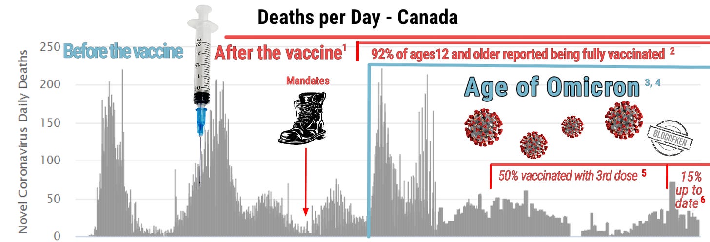
I posted a version of the above chart on my social media channels a little while ago, and immediately had various people busting my balls for the usual reasons, namely proper source citations and the old faithful correlation doesn’t equal causation argument. I never mind too much if people want to argue with me because I have thought about it, and so I have at least a decent idea of why I believe what I do. Also, I always have good sources for my information, even if I don’t link to them in these articles. Obviously, this doesn’t mean I have any more hope of convincing anyone, but at least I’m able to engage these would-be ball-busters. I should also add that this doesn’t necessarily mean that I’m right, but the main reason these discussions need to be had in the first place is so that we can all get a little closer to being right about what we believe. It’s also helpful if that’s a shared goal.
One great thing about the challenging of ideas is that it can inspire the holder of said ideas to dig a little deeper in order to confirm what he asserts - at least, that’s the idea.
So, in the spirit of digging a little deeper, I’ve adjusted this chart a little bit and added the relevant sources so that these busters of balls can check them out and come to their own conclusions. I honestly don’t expect many of them to do that, since most of the time these social media characters are screaming for source!! it’s simply an attempt to exert a form of control and appear more intelligent than they actually are. At least the option is now there if they’d like to take advantage of it.
The Chart Explained
The main chart is from Worldometers.com and can be found here. The rest of the info (brilliantly referred to as scribbles, clip-art, and facebook-meme-worthy by one clever Redditor) will be referenced below.
When covid made itself known in the spring of 2020, it was obviously somewhat novel, in the sense that no one was immune to it, which explains the relatively high death toll early on. This death toll was of course mainly relegated to the old and frail. By the time the first dose of the vaccine was available here, the second wave was already well underway. This wave just so happened to coincide with the regular annual cold and flu season.
In the middle of August, hoping to look virtuous in the eyes of his supporters, Prime Minister Justin Trudeau brought in vaccine mandates, travel restrictions, and vaccine passports. As evidenced by the chart, this did absolutely nothing in terms of stopping vulnerable people from dying, but it did prevent many of these dying people from seeing their loved ones on their way out.
By November of 2021, most of the country had received two shots of the covid “vaccine”, in fact according to Statistics Canada, 92% of Canadians aged 12 and older reported being fully vaccinated at this time. This fact didn’t do much to blunt the third wave (which, again seemed to happen at the same time as our regularly expected cold and flu season), but it did allow us to go watch a hockey game and eat out at our favourite restaurants.
Right around the time the third wave was ramping up, the latest variant, Omicron was fast becoming the dominant strain. While not nearly as deadly as the previous iterations, it was evidently much more contagious (at least initially). By January of 2022, the vast majority of cases (95-97%) were Omicron and the rest were presumed to be Delta. Presumably there were also still people dying of Delta at the time.
We can see the impact Omicron had after that third wave had subsided a bit. I realize that our government would love to take all the credit for that in the form of supplying the shots, but by October, only 50% of Canadians had bothered to get the third shot. By December, 2023, only 15% of Canadians are vaccinated “as per recommendation” and so presumably this decline began immediately after most people got the second shot - probably in early 2022. As you can see, the fact that so few people are “vaccinated” has not increased the death rate at all, in fact it looks like it’s done the exact opposite, if it’s done anything.
Correlation Doesn’t Equal Causation
This is the big gotcha argument that I heard a lot in regards to this chart. Of course it’s true - just because people were dying without the vaccine, and then after the vaccine, vaccinated people were still dying that doesn’t necessarily mean the vaccine was useless, but it doesn’t look good.
In light of the actual facts, and given that Pfizer’s trials never proved that their product would save lives, stop transmission, or even prevent hospitalization (which presumably explains their disclaimer), it seems like maybe that same argument could be levelled against the proponents of these shots. Regardless of the official story, what it really looks like is that this disease is driven by seasonality, much like the flu, regardless of how many people get the shot.
Since the Age of Omicron, we haven’t seen anything like the first three waves - even with very low levels of vaccination. At the same time, the death toll has been more than cut in half due to a combination of herd immunity and the less deadly strain of the virus. How much of this herd immunity is due to the vaccine? Who knows? I’m sure it depends who you ask, but the bottom line is that some vaccinated people are still dying from this less virulent strain and many unvaccinated people are not.
It’s easy to see whatever correlation you’d like to see, but the simplest one seems to be what I said above, namely that this disease is driven by seasonality, regardless of vaccination status. We’ll never know for sure, but it’s very possible that had we done nothing at all in terms of non-pharmaceutical interventions (masks, lockdowns, school closures, social distancing), these charts would look exactly the same, and had we not even bothered with a “vaccine”, they may still have not been much different.
References:
CTV News - First dose of covid vaccine in Canada:
'Historic moment': Health Canada approves Pfizer COVID-19 vaccine
Statistics Canada - From September to mid-November 2021, 92% of Canadians aged 12 and older reported being fully vaccinated:
Majority of Canadians are willing to get a COVID-19 booster dose
CBC News - Omicron detected on November 28, 2021:
Canada's first cases of the omicron coronavirus variant confirmed in Ottawa
Global News - Omicron becomes dominant in December, 2021:
Omicron changed the course of the pandemic 1 year ago and still dominates. What’s next?
CBC News - As of October, 2022, 49.6% of Canadians have a third shot:
Facing a fall COVID surge, Tam calls on Canadians to get their bivalent booster shots
Health Canada - As of December 8, 2023, 15% of Canadians are vaccinated as per recommendation:
COVID-19 vaccination: Vaccination coverage


Neither Canada nor US ever envisioned herd immunity against CoVid. They wanted then and still only demand now, herd mentality. One other thought...note how when the weather gets nice each spring and summer the numbers of deaths magically went down - both before 'vaccines' were available and afterwards. This indicates, to me anyway, that fresh air and sunshine are excellent (perhaps the best?) disinfectants for the human immune system...just like everyone's grandparents have told us for decades. Which begs the question: where's the imperical evidence that shows otherwise-healthy 'vaccinated' people fared "better" than the healthy unvaxxed? Lastly, one should have known that *every* contagious viral outbreak tends to affect the elderly and immune-compromised among us at the highest rates. We've known that for a couple of centuries now. CoVid didn't change that. Good post, Ken.
This post is blindingly ironic. You’ve found a study about biases, which apparently confirms your personal beliefs (all scientists are liars for some vague reason, it’s bad when governments govern etc.), and you hold it up as ‘proof’ that you were right all along. This is a textbook example of confirmation bias in action.